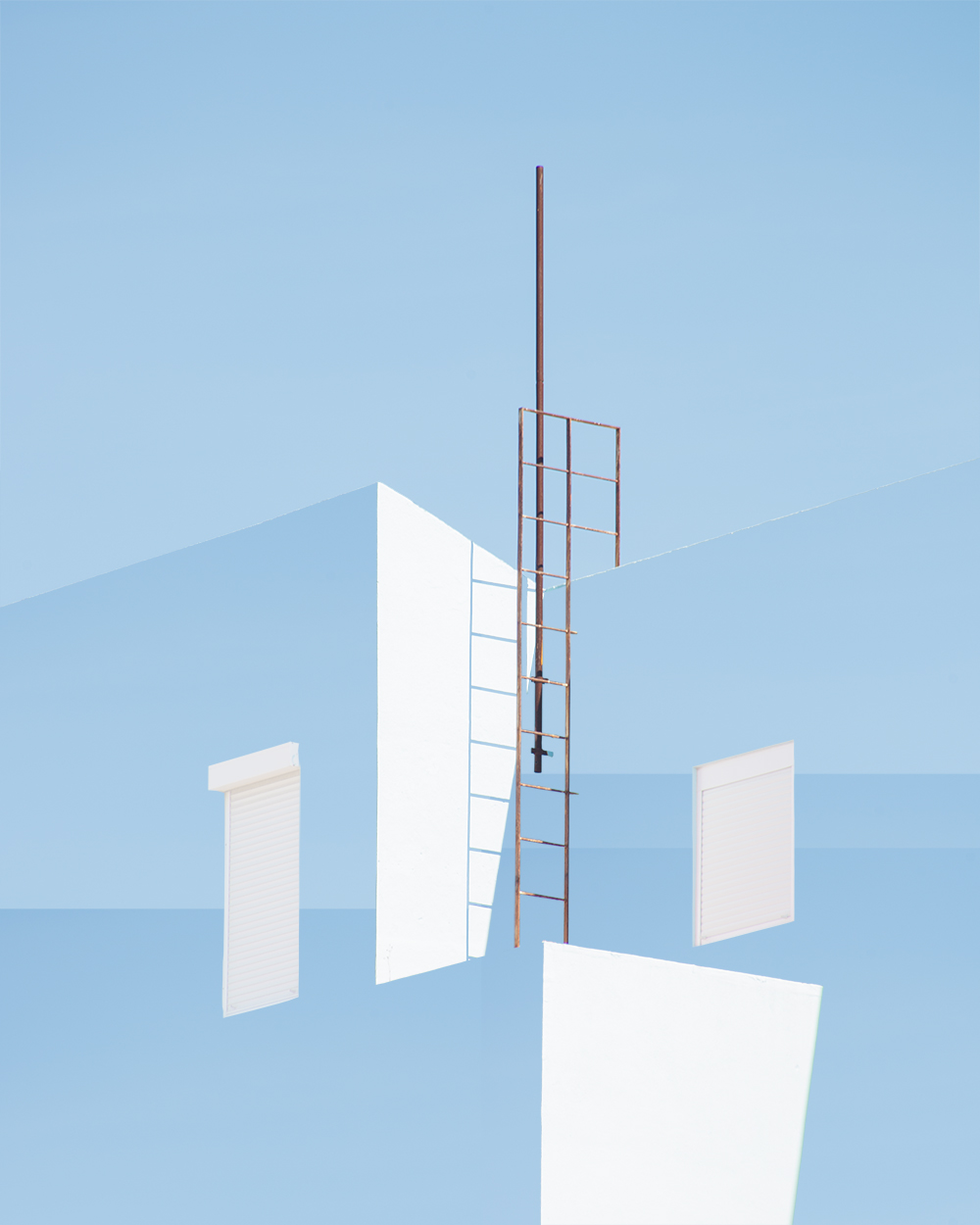
The flat, graphic, simple and streamlined architecture shots by Matthieu Venot are largely of the picturesque Brest. Wandering the French city by bicycle. Drawn to color and form, Matthieu seeks out street corners, hidden buildings and sights of interest. Calming, serene and incredibly stylish, it’s no wonder the French photographer’s imagery has been featured on leading creative platforms, such as It’s Nice That, GQ, Creative Boom and Aesthetica.
Matthieu takes over our Instagram feed this week (September 29 to October 5). We caught up with him to discover more about his photographic practice.
Colour and form are key elements in your work, what are your creative inspirations?
Artists are my inspiration. I love Daniel Arsham and Olafur Eliasson, and a lot of painters too – such as Paul Kremer, Henri Matisse and Edward Hopper. Some photographers influence me, like Andreas Gursky and Massimo Vitali. For me, any art imbued with emotion is of interest.
How much does a photographer need to change their aesthetic to reflect current trends?
I think any good photograph is timeless. My advice to others would be don’t follow trends just follow your heart.
Your Instagram feed is well-curated. How much time and thought do you put into uploading your work on social media?
Thank you. If I have a new project I’d like to showcase I definitely think of the images as a group - how they appear as a triptych and then a grid of nine. I largely sequence work depending on color.
How do you think your past career as a sound engineer has influenced how you photograph the world?
I studied music and then became a sound engineer but it was not creative enough for more - it was too technical. I realized I had a real need to produce something of my own, my interpretation of the world. I definitely compose differently now to how I did when I first picked up a camera. I try to fit more things into each frame. I guess a photographer is constantly training their eye like sound engineers train their ear - you should be constantly refining your chosen art.
The color you use leaves the viewer feeling calm and positive. How much does color theory play a part in how you edit your images?
I like that my images are a ‘pick me up’ for people. How great is that to think you are changing somebody’s mood for the better? In the modern world we are living faster and faster, and so many people are stressed. I use pastel colors to help viewers slow down and feel good.
Late last year you published your first book Faire tenir les murs - vingt neuf deux cents. Do you plan to create another book? Or an exhibition perhaps? Tell us what's next in the pipeline for you.
I have an exhibition in Paris this coming November.
Enjoy Matthieu’s takeover of our Instagram feed here.
Discover the rest of his portfolio here.
Watch this short video about Matthieu’s approach to photography.


