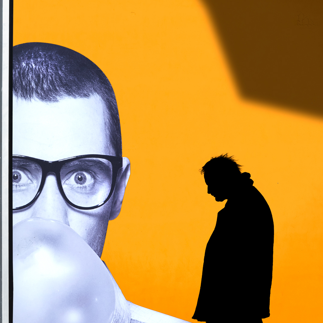
Greek photographer George Natsioulis looks at how light and dark, shape and form, color and balance interplay to create his poetic renditions of the street. Including the city's residents, as they go about their daily business, often alone and otherwise unnoticed, George utilizes these figures to add impact to his already graphic composition. First picking up a camera when he was 15 years-old, George was a fan of the 35mm format before he moved to digital in 2006. Using a square format and a distinctive, eye-catching aesthetic, George's pictures have garnered much attention online/
George takes over our Instagram feed this week (11 to 17 August), sharing his delightful street photographs. Ahead of his takeover, he answers our quick-fire questions.
What is it about the street that intrigues you as a photographer?
When I started in photography I enjoyed taking pictures of the landscape and art events. When I started to pursue my professional career, I gravitated towards commercial photography. I started focusing on the street about two or three years ago. Before that I always admired the subject. When I immersed myself in the genre I realized how much I loved it. Over time I try to improve as much as I can.
How much does previsualization play a part in your approach?
I always have an idea of the type of picture I'd like before I go out on the street; I try to seek out the right person and the perfect place. Timing however – which is a key part of successful street photography – takes a lot of patience and experience. I'll let you all into a dark secret...not all of my photographs are perfect, I just publish the best!
Your work seems inspired by abstract painting. What are your creative influences?
Yes, abstract artwork heavily influences how I compose a scene. I first look at the shadows and color tones when creating a picture. A lot of my creative influences usually come from art movements of early to mid 20th century. My favorite artists include René Magritte, Piet Mondrian and Andy Warhol.
A lot of your pictures have a solitary figure within each frame. What is it about the individual person – rather than a crowd – that inspires you?
I think it stems back to my fondness for minimalism. Combine a single figure – maximum two – with clean lines, bold shapes and vivid color and the viewer can easily understand the image without being confused.
What one piece of advice would you give to your younger self?
To never give up, even in the most difficult times.
Style, rather than narrative, seems to dominate in your images. Do you agree?
Yes, aesthetic does take the lead, I love vertical lines, symmetry and geometric shapes.
See George's portfolio here.
Enjoy his takeover here.


